> ## Documentation Index
> Fetch the complete documentation index at: https://docs.honeyhive.ai/llms.txt
> Use this file to discover all available pages before exploring further.
# Creating Custom Charts
> How to use HoneyHive's query builder interface to monitor performance and drive systematic improvements at scale.
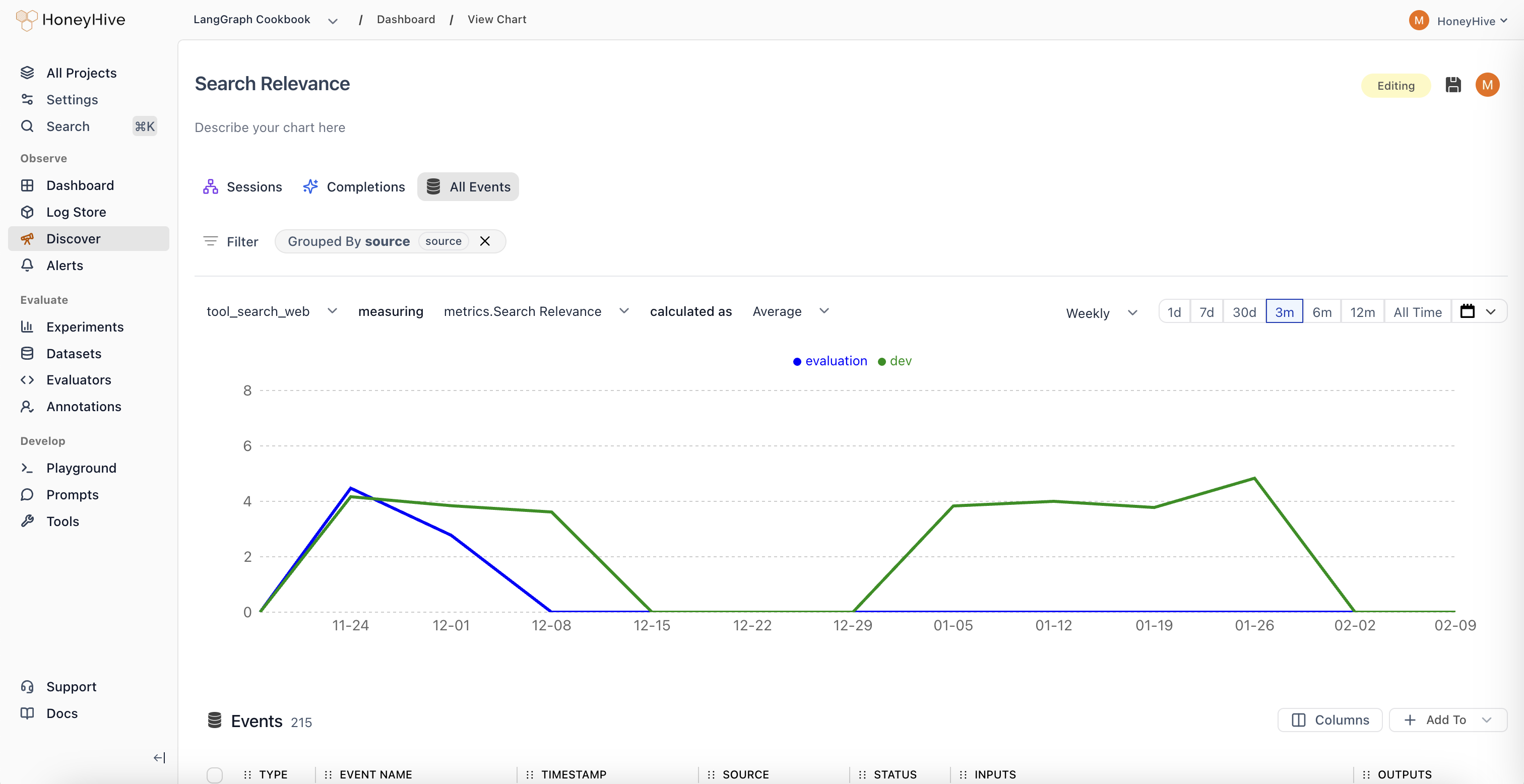 ## Quick Start: Building Your First Chart
Creating insightful visualizations in HoneyHive is straightforward. Follow these steps to start monitoring your LLM application performance:
1. **Access the Chart Builder**
* Click "New Chart" in your Dashboard, or
* Navigate to the "Discover" tab from the sidebar
2. **Select Your Data Source**
* Choose from three data scopes:
* **Sessions**: Full user interactions/traces (entire conversations)
* **Completions**: Individual LLM calls
* **All Events**: Any tracked step in your pipeline, including tool calls
3. **Configure Your Visualization**
* **Event**: Select which specific event type to analyze (default: All Sessions/Completions/Events)
* **Metric**: Choose what to measure (e.g., Request Volume, Duration, Cost, or custom evaluators)
* **Aggregation**: Decide how to calculate (Sum, Average, Median, 99th Percentile, etc.)
4. **Refine Your Analysis (Optional)**
* **Filter**: Narrow down to specific data segments (e.g., `source = "production"`)
* **Group By**: Split results by properties (e.g., `prompt_version`, `model`, \`user\_tier)
* **Time Range**: Set your analysis window (1d, 7d, 30d, etc.)
## Understanding Your Data
To build effective charts, it's crucial to understand the data components available in HoneyHive:
### Metrics
Metrics are the numerical values you'll visualize in charts:
1. **Usage Metrics**
* `Request Volume`: Queries over time. Spot usage spikes or drops.
* `Cost`: Direct expenses. See if that new feature is breaking the bank.
* `Duration`: System latency. Because slow responses kill engagement.
2. **Evaluators**
* Definition: Your custom quality checks, either Python or LLM-based.
* Requirements: Must return `float` or `boolean` to chart.
* Examples:
* `Keyword Presence` (boolean): "Does every product review mention the product?"
* `Coherence Score` (float): "How logically sound are multi-turn conversations?"
3. **User Feedback**
* Definition: The voice of your users, quantified.
* Requirements: `float` or `boolean` inputs.
* Examples:
* `Usefulness Rating` (float): "On a scale of 1-5, how useful was this response?"
* `Used in Report` (boolean): "Did the user actually use this in their report?"
### Properties
Properties provide context for your metrics. All properties in the [data model](/schema-overview) such as `config`, `user properties`, `feedback`, `metrics`, and `metadata` can be used to slice and dice your data.
Metrics chart performance. Properties unveil the context behind that performance. Both are crucial for exploratory data analysis.
## Chart Types in Detail
Each chart type in HoneyHive focuses on different parts of your LLM pipeline:
### Completion Charts
* **Focus**: Individual LLM calls.
* **Key Metrics**: `cost`, `duration`, `tokens`, `errors`, and any specified evaluators.
* **Example Use Case**:
* Hypothesis: "Longer user messages cause more token waste."
* Test: Chart `Average Unused Output Tokens` grouped by `binned_input_length`.
### Session Charts
* **Focus**: Full user interactions and entire traces.
* **Key Metrics**: `User Turns`, `Session Duration`, `Avg User Rating`, `Agent Trajectory`.
* **Example Use Case**:
* Hypothesis: "Agents start looping after `n` turns."
* Test: Chart `Agent Trajectory Evaluator` grouped by `Number of turns`.
### Event Charts
* **Focus**: Specific steps or tools.
* **Key Metrics**: `Retrieval Latency`, `Synthesis Quality`, `Tool Choice Accuracy`.
* **Example Use Case**:
* Hypothesis: "Our reranker is the bottleneck in high-load scenarios."
* Test: Chart `99th Percentile Rerank Time` vs. `Requests per Minute`.
## Advanced Chart Building Techniques
* **Process**: Pick chart type, then a relevant metric.
* **Real-world Usage**:
* Don't just track `Request Volume`. Ask: "Is volume growing faster for paid or freemium?"
* Beyond `Cost`, ponder: "Is cost per successful session decreasing over time?"
* **Key Functions**:
* `Average`: Typical case. "What's our usual response time?"
* `99th Percentile`: Edge cases. "How bad does it get for our unluckiest users?"
* `Percentage True`: For booleans. "What % of responses are factually correct?"
* **Real-world Usage**:
* `Average` is good, but `Median` might better represent a skewed distribution.
* Watch both `Average` and `99th Percentile` to catch issues averages hide.
* **Filtering**:
* Syntax: `property operator value`. E.g., `industry == "finance"`.
* Examples:
* `topic_category != "smalltalk"` to focus on core use cases.
* `embedding_model == "v2" AND date > model_switch_date` for before/after analysis.
* **Grouping**:
* Syntax: Select properties. E.g., `prompt_template`, `user_tier`.
* Examples:
* `prompt_template` to see which prompts waste tokens.
* `user_tier` and `topic_category` to see if premium users ask harder questions.
## Quick Start: Building Your First Chart
Creating insightful visualizations in HoneyHive is straightforward. Follow these steps to start monitoring your LLM application performance:
1. **Access the Chart Builder**
* Click "New Chart" in your Dashboard, or
* Navigate to the "Discover" tab from the sidebar
2. **Select Your Data Source**
* Choose from three data scopes:
* **Sessions**: Full user interactions/traces (entire conversations)
* **Completions**: Individual LLM calls
* **All Events**: Any tracked step in your pipeline, including tool calls
3. **Configure Your Visualization**
* **Event**: Select which specific event type to analyze (default: All Sessions/Completions/Events)
* **Metric**: Choose what to measure (e.g., Request Volume, Duration, Cost, or custom evaluators)
* **Aggregation**: Decide how to calculate (Sum, Average, Median, 99th Percentile, etc.)
4. **Refine Your Analysis (Optional)**
* **Filter**: Narrow down to specific data segments (e.g., `source = "production"`)
* **Group By**: Split results by properties (e.g., `prompt_version`, `model`, \`user\_tier)
* **Time Range**: Set your analysis window (1d, 7d, 30d, etc.)
## Understanding Your Data
To build effective charts, it's crucial to understand the data components available in HoneyHive:
### Metrics
Metrics are the numerical values you'll visualize in charts:
1. **Usage Metrics**
* `Request Volume`: Queries over time. Spot usage spikes or drops.
* `Cost`: Direct expenses. See if that new feature is breaking the bank.
* `Duration`: System latency. Because slow responses kill engagement.
2. **Evaluators**
* Definition: Your custom quality checks, either Python or LLM-based.
* Requirements: Must return `float` or `boolean` to chart.
* Examples:
* `Keyword Presence` (boolean): "Does every product review mention the product?"
* `Coherence Score` (float): "How logically sound are multi-turn conversations?"
3. **User Feedback**
* Definition: The voice of your users, quantified.
* Requirements: `float` or `boolean` inputs.
* Examples:
* `Usefulness Rating` (float): "On a scale of 1-5, how useful was this response?"
* `Used in Report` (boolean): "Did the user actually use this in their report?"
### Properties
Properties provide context for your metrics. All properties in the [data model](/schema-overview) such as `config`, `user properties`, `feedback`, `metrics`, and `metadata` can be used to slice and dice your data.
Metrics chart performance. Properties unveil the context behind that performance. Both are crucial for exploratory data analysis.
## Chart Types in Detail
Each chart type in HoneyHive focuses on different parts of your LLM pipeline:
### Completion Charts
* **Focus**: Individual LLM calls.
* **Key Metrics**: `cost`, `duration`, `tokens`, `errors`, and any specified evaluators.
* **Example Use Case**:
* Hypothesis: "Longer user messages cause more token waste."
* Test: Chart `Average Unused Output Tokens` grouped by `binned_input_length`.
### Session Charts
* **Focus**: Full user interactions and entire traces.
* **Key Metrics**: `User Turns`, `Session Duration`, `Avg User Rating`, `Agent Trajectory`.
* **Example Use Case**:
* Hypothesis: "Agents start looping after `n` turns."
* Test: Chart `Agent Trajectory Evaluator` grouped by `Number of turns`.
### Event Charts
* **Focus**: Specific steps or tools.
* **Key Metrics**: `Retrieval Latency`, `Synthesis Quality`, `Tool Choice Accuracy`.
* **Example Use Case**:
* Hypothesis: "Our reranker is the bottleneck in high-load scenarios."
* Test: Chart `99th Percentile Rerank Time` vs. `Requests per Minute`.
## Advanced Chart Building Techniques
* **Process**: Pick chart type, then a relevant metric.
* **Real-world Usage**:
* Don't just track `Request Volume`. Ask: "Is volume growing faster for paid or freemium?"
* Beyond `Cost`, ponder: "Is cost per successful session decreasing over time?"
* **Key Functions**:
* `Average`: Typical case. "What's our usual response time?"
* `99th Percentile`: Edge cases. "How bad does it get for our unluckiest users?"
* `Percentage True`: For booleans. "What % of responses are factually correct?"
* **Real-world Usage**:
* `Average` is good, but `Median` might better represent a skewed distribution.
* Watch both `Average` and `99th Percentile` to catch issues averages hide.
* **Filtering**:
* Syntax: `property operator value`. E.g., `industry == "finance"`.
* Examples:
* `topic_category != "smalltalk"` to focus on core use cases.
* `embedding_model == "v2" AND date > model_switch_date` for before/after analysis.
* **Grouping**:
* Syntax: Select properties. E.g., `prompt_template`, `user_tier`.
* Examples:
* `prompt_template` to see which prompts waste tokens.
* `user_tier` and `topic_category` to see if premium users ask harder questions.