Quick Start: Building Your First Chart
Creating insightful visualizations in HoneyHive is straightforward. Follow these steps to start monitoring your LLM application performance:-
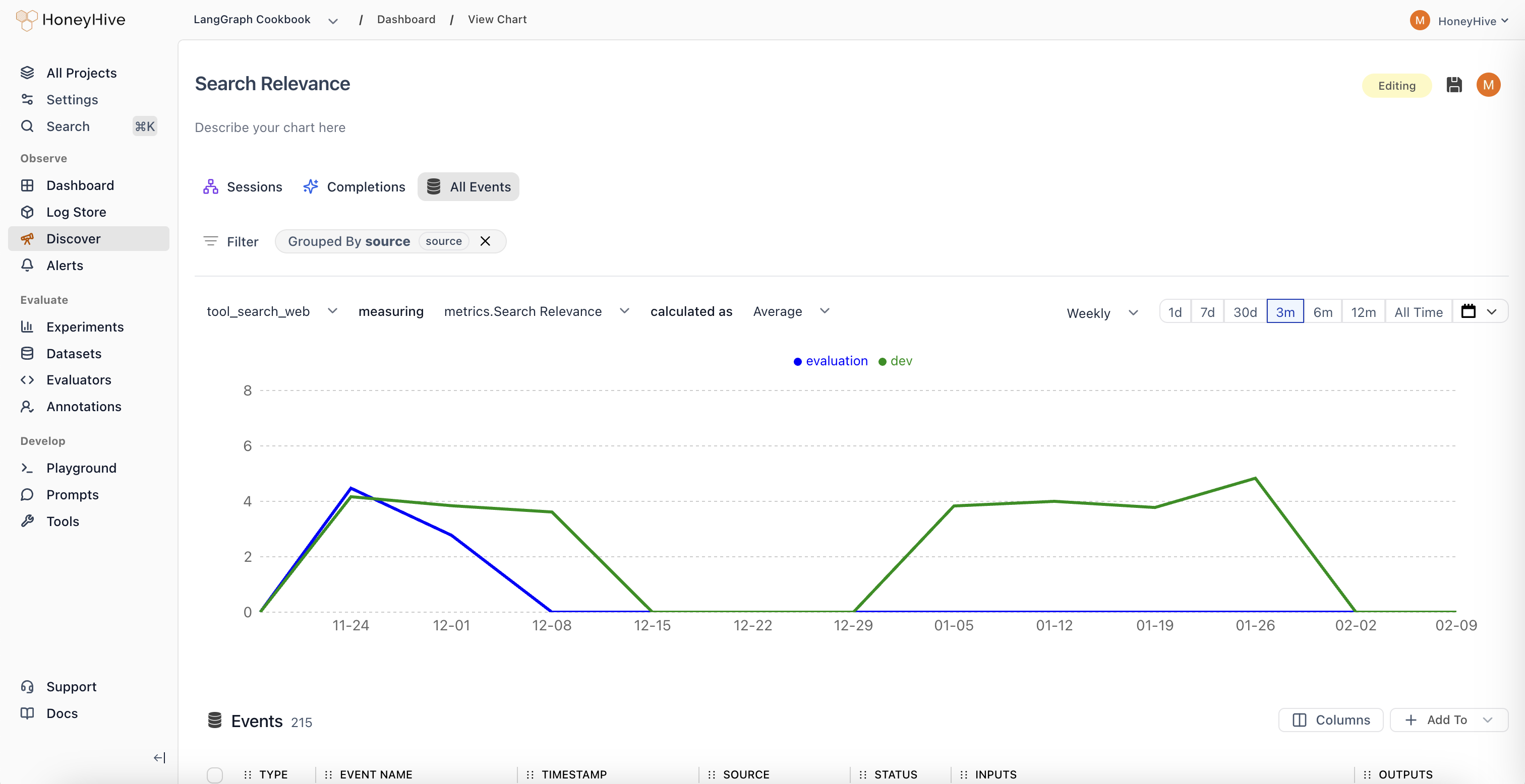
Access the Chart Builder
- Click “New Chart” in your Dashboard, or
- Navigate to the “Discover” tab from the sidebar
-
Select Your Data Source
- Choose from three data scopes:
- Sessions: Full user interactions/traces (entire conversations)
- Completions: Individual LLM calls
- All Events: Any tracked step in your pipeline, including tool calls
- Choose from three data scopes:
-
Configure Your Visualization
- Event: Select which specific event type to analyze (default: All Sessions/Completions/Events)
- Metric: Choose what to measure (e.g., Request Volume, Duration, Cost, or custom evaluators)
- Aggregation: Decide how to calculate (Sum, Average, Median, 99th Percentile, etc.)
-
Refine Your Analysis (Optional)
- Filter: Narrow down to specific data segments (e.g.,
source = "production") - Group By: Split results by properties (e.g.,
prompt_version,model, `user_tier) - Time Range: Set your analysis window (1d, 7d, 30d, etc.)
- Filter: Narrow down to specific data segments (e.g.,
Understanding Your Data
To build effective charts, it’s crucial to understand the data components available in HoneyHive:Metrics
Metrics are the numerical values you’ll visualize in charts:-
Usage Metrics
Request Volume: Queries over time. Spot usage spikes or drops.Cost: Direct expenses. See if that new feature is breaking the bank.Duration: System latency. Because slow responses kill engagement.
-
Evaluators
- Definition: Your custom quality checks, either Python or LLM-based.
- Requirements: Must return
floatorbooleanto chart. - Examples:
Keyword Presence(boolean): “Does every product review mention the product?”Coherence Score(float): “How logically sound are multi-turn conversations?”
-
User Feedback
- Definition: The voice of your users, quantified.
- Requirements:
floatorbooleaninputs. - Examples:
Usefulness Rating(float): “On a scale of 1-5, how useful was this response?”Used in Report(boolean): “Did the user actually use this in their report?”
Properties
Properties provide context for your metrics. All properties in the data model such asconfig, user properties, feedback, metrics, and metadata can be used to slice and dice your data.
Chart Types in Detail
Each chart type in HoneyHive focuses on different parts of your LLM pipeline:Completion Charts
- Focus: Individual LLM calls.
- Key Metrics:
cost,duration,tokens,errors, and any specified evaluators. - Example Use Case:
- Hypothesis: “Longer user messages cause more token waste.”
- Test: Chart
Average Unused Output Tokensgrouped bybinned_input_length.
Session Charts
- Focus: Full user interactions and entire traces.
- Key Metrics:
User Turns,Session Duration,Avg User Rating,Agent Trajectory. - Example Use Case:
- Hypothesis: “Agents start looping after
nturns.” - Test: Chart
Agent Trajectory Evaluatorgrouped byNumber of turns.
- Hypothesis: “Agents start looping after
Event Charts
- Focus: Specific steps or tools.
- Key Metrics:
Retrieval Latency,Synthesis Quality,Tool Choice Accuracy. - Example Use Case:
- Hypothesis: “Our reranker is the bottleneck in high-load scenarios.”
- Test: Chart
99th Percentile Rerank Timevs.Requests per Minute.
Advanced Chart Building Techniques
Choose Your Metric (What to Measure)
- Process: Pick chart type, then a relevant metric.
- Real-world Usage:
- Don’t just track
Request Volume. Ask: “Is volume growing faster for paid or freemium?” - Beyond
Cost, ponder: “Is cost per successful session decreasing over time?”
- Don’t just track
Apply Aggregation (How to Measure)
- Key Functions:
Average: Typical case. “What’s our usual response time?”99th Percentile: Edge cases. “How bad does it get for our unluckiest users?”Percentage True: For booleans. “What % of responses are factually correct?”
- Real-world Usage:
Averageis good, butMedianmight better represent a skewed distribution.- Watch both
Averageand99th Percentileto catch issues averages hide.
Filter and Group (Segmenting Data)
- Filtering:
- Syntax:
property operator value. E.g.,industry == "finance". - Examples:
topic_category != "smalltalk"to focus on core use cases.embedding_model == "v2" AND date > model_switch_datefor before/after analysis.
- Syntax:
- Grouping:
- Syntax: Select properties. E.g.,
prompt_template,user_tier. - Examples:
prompt_templateto see which prompts waste tokens.user_tierandtopic_categoryto see if premium users ask harder questions.
- Syntax: Select properties. E.g.,