

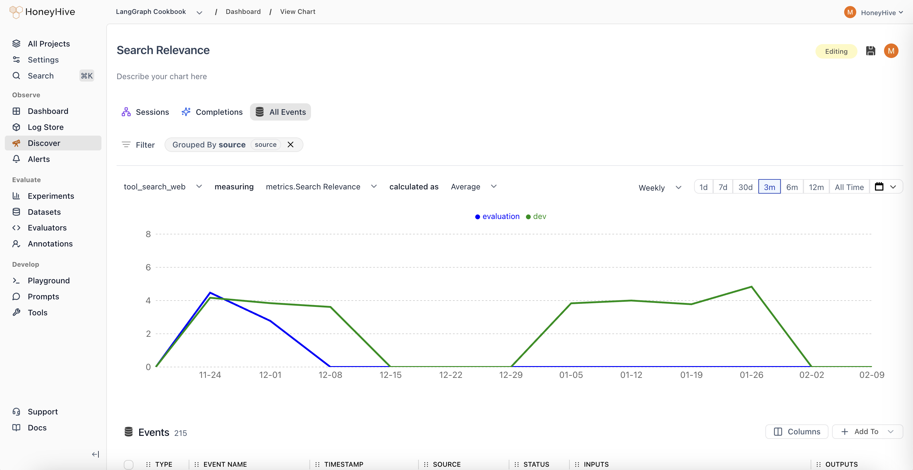
Quick Start: Building Your First Chart
Creating insightful visualizations in HoneyHive is straightforward.1
Access Discover
Click New Chart in your Dashboard, or navigate to the Discover tab from the sidebar.
2
Select Your Data Source
Choose from three data scopes:
3
Configure Your Visualization
4
Refine Your Analysis (Optional)
Understanding Your Data
To build effective charts, it helps to understand the data components available in HoneyHive.Metrics
Metrics are the numerical values you visualize in charts.Usage Metrics
Usage Metrics
Evaluators
Evaluators
User Feedback
User Feedback
The voice of your users, quantified. Accepts
float or boolean inputs.Properties
Properties provide context for your metrics. All properties in the enrichment schema such asconfig, user properties, feedback, metrics, and metadata can be used to slice and dice your data.
Chart Types
Each chart type focuses on a different part of your LLM pipeline.- Completions
- Sessions
- Events
Focus: Individual LLM calls.Key Metrics:
cost, duration, tokens, errors, and any specified evaluators.Example use case
Example use case
Hypothesis: “Longer user messages cause more token waste.”Test: Chart
Average Unused Output Tokens grouped by binned_input_length.Programmatic Chart Management
Use the first-party TypeScript API SDK or HoneyHive CLI to create, list, retrieve, update, and delete dashboard charts from scripts or CI jobs. In the TypeScript API SDK, use theclient.charts namespace. In the CLI, use the honeyhive charts commands. Project API keys need the corresponding project.chart.* permissions.
Next Steps
Set Up Alerts
Get notified when metrics exceed thresholds
Online Evaluations
Run evaluators automatically on production traces