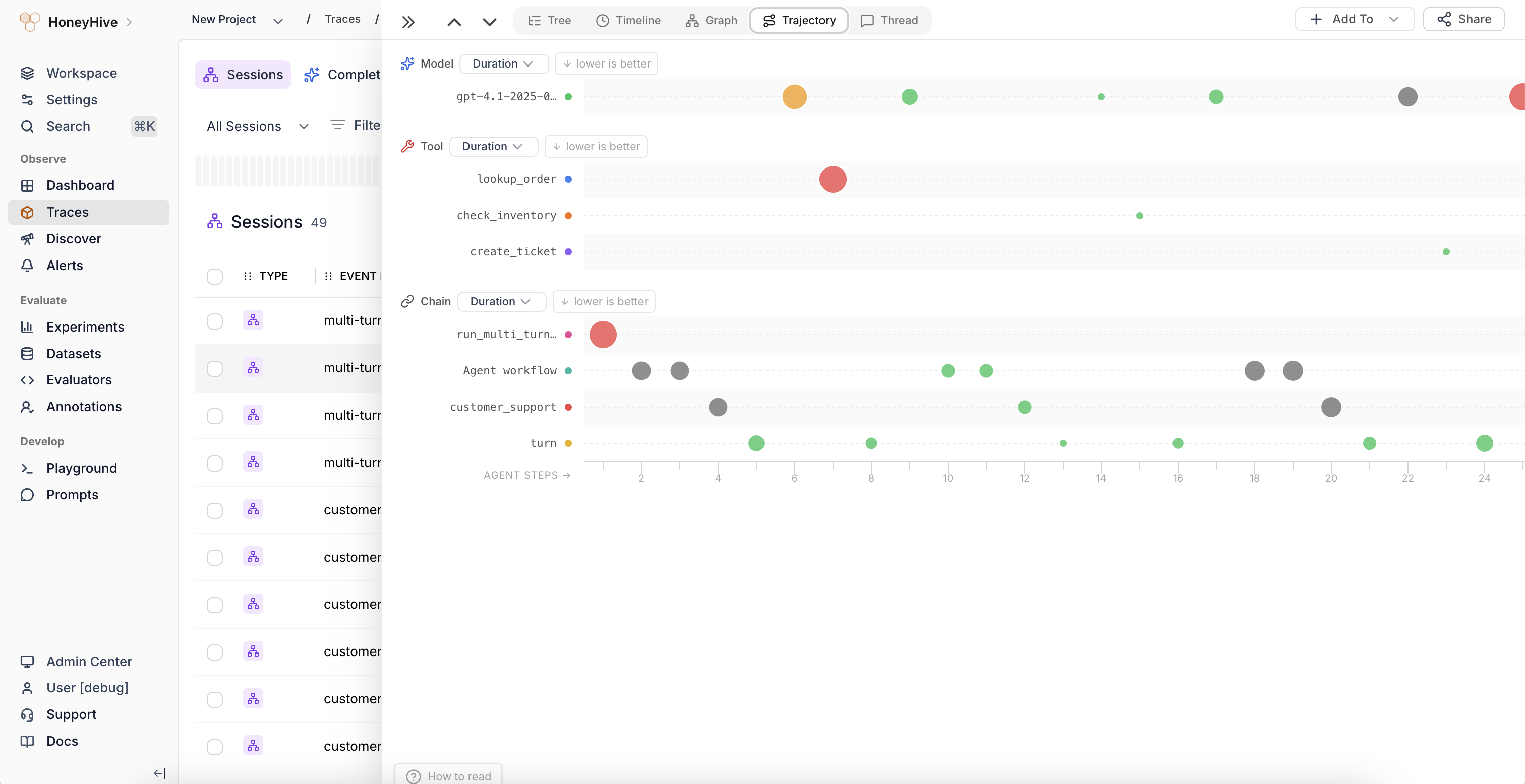
Reading the chart
- Y-axis groups spans by event type and name (e.g., Model:
customer_support, Tool:search_knowledge_base) - X-axis shows chronological step order (Agent Steps 1, 2, 3…)
- Bubble size represents the selected metric value (duration by default). Larger bubbles indicate higher values, making outliers easy to spot
- Bubble color uses a green-to-red gradient based on the metric. Green indicates good performance, red indicates poor performance, relative to whether higher or lower values are better for that metric
Switching metrics
Each event-type group (Model, Tool, Chain) has a dropdown to switch the displayed metric:- Duration - how long each span took
- Cost - estimated cost of the operation
- Evaluator scores - any evaluator metrics attached to the spans
Interacting with bubbles
Click any bubble to jump to that span in the Tree view, where you can inspect its full inputs, outputs, and metadata.When to use
Use the Trajectory view to:- Spot behavioral patterns across agent steps (e.g., repeated tool calls, escalating latency)
- Compare how different agent runs unfold structurally
- Identify anomalous steps where a metric spikes unexpectedly
- Understand the rhythm of model-tool-chain interactions in agentic workflows